Box Cover
Project Details
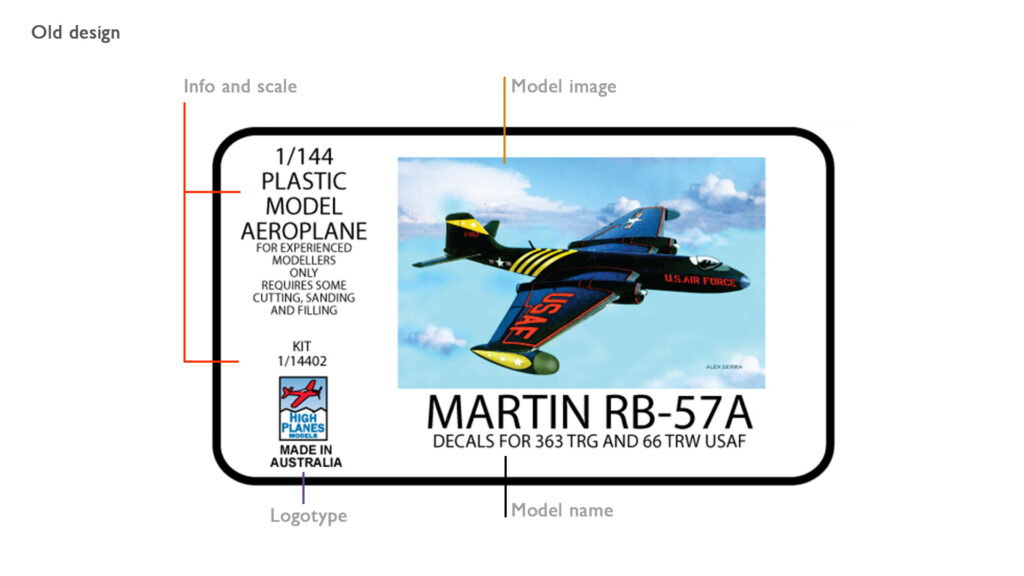
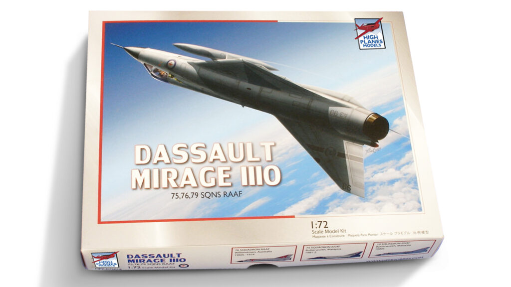
The redesign was a consequence of the illustration works that were already done. There is no sense in giving an upgrade to the image cover while all the other infos get structured in the same they were, even more with fail reading hierarchy. So the first point was to reorder all the box cover components. The Image gained the a larger area highlighting the product, the text informing the scale, for who it was and etc was reduced and got the status of complement. The logo got a bit bigger and a new and clear area to be seen, dettached from the other information. The same happened to model name, besides got a newer and more readble font family.
- design
Recent Entries
-
Getting in the mapFinding your localization
-
Showing yourselfPresentation
-
Keeping your image aliveCampaigns


