Logotype
Business consult office
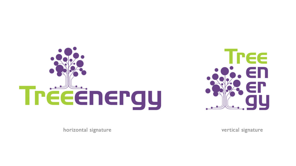
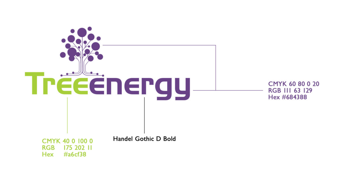
Challenges are always welcome and this was one of many received. The point here was to turn the triple E (efficiency, efficacy and effectiveness), plus the growth with results ideas into an image. The name already had the word tree in it, but how to add all the initial points to the tree without being too literal. The solution was to turn the tree into a connection tree with small dots (inputs) in the "roots" and the results in the top of the tree as fruits. The chosen colors are related to a youth vision. Besides, the violet color tends to create creativity and thoughts. One of the mainstream work of this business is the consulting office.
- design
- Graphic
Recent Entries
-
Getting in the mapFinding your localization
-
Showing yourselfPresentation
-
Keeping your image aliveCampaigns

