Coorporate identity
Therapy center
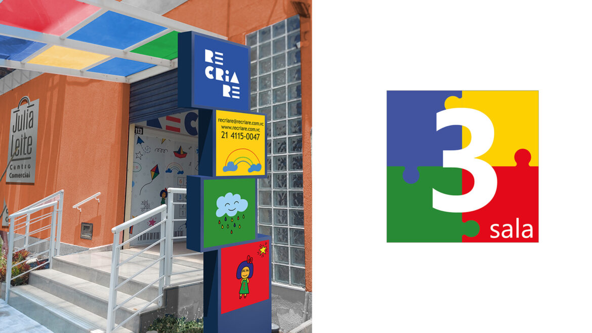
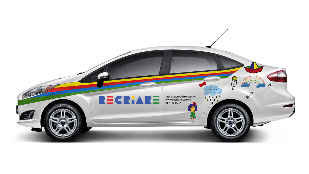
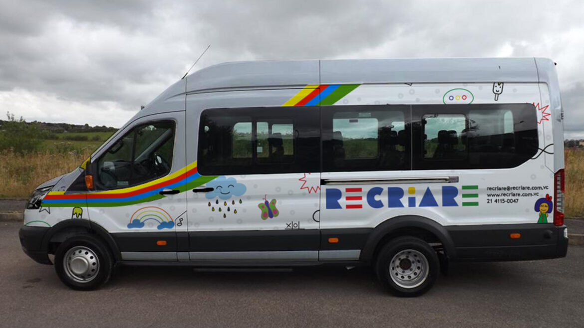
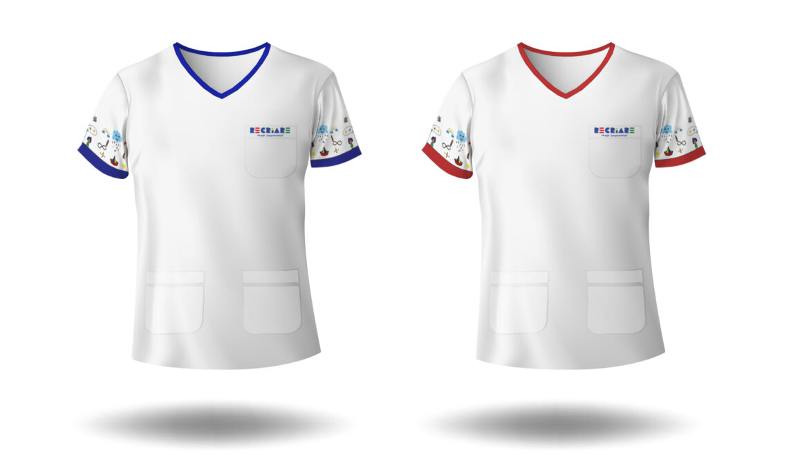
Devoted to children with ASD, this therapy center wanted to integrate the visual approach to the kids that was under treatment with them and at the same time to distinguish from the other concurrent centers. The colors used to pop up the sign, vehicles, stationery and all other graphic materials were the one related to autism, red, yellow, blue and green. To support this approach was used graphic images and elements related to the focus group, like stars, butterfly, paper boat and so on. The images on the left are from a facade with its sign, a room sign, vehicles and uniform.
- design
Recent Entries
-
Getting in the mapFinding your localization
-
Showing yourselfPresentation
-
Keeping your image aliveCampaigns

