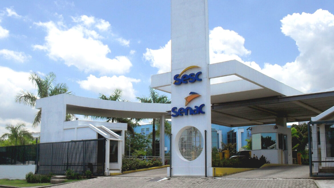
The development of facade identification was elaborated by me.
I mean, the corporate Identity manual at the time had no lines about how to apply or structure it. If it would be illuminated or not at night.
The reason for this lack in manual was simple, the logo was entirely new and the hired company who developed it did not attempt to do that.
Besides, the Senac company was in the changing process of all corporate stationery, uniforms, etc.
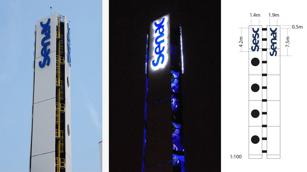
So a suggestion was done and in it there was a back light proposition for both facades.
At the same time that the light would generate a white glowing blur over the walls and in the back of the sign, the acrylic colored cover would allow the light to pass a bit through it.
So that, at night the logotype in its colors as well as the light surrounding the sign can be seen yards away from it.


