Label
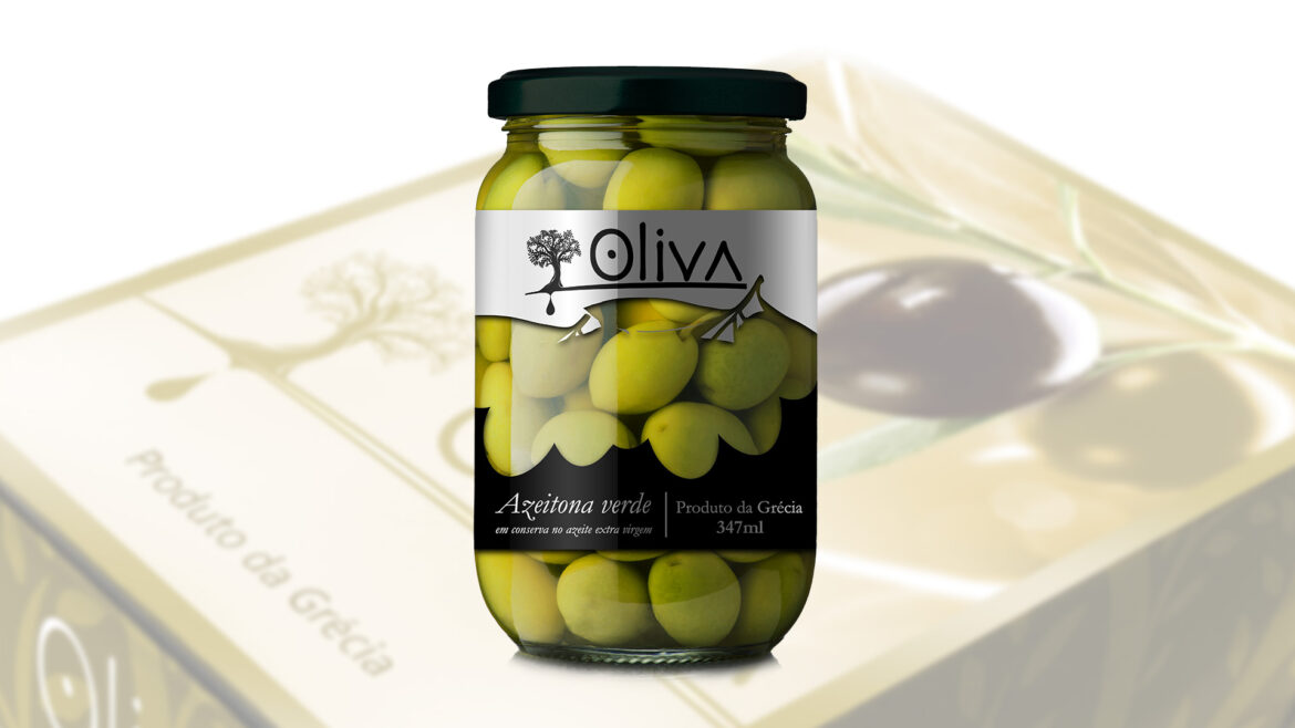
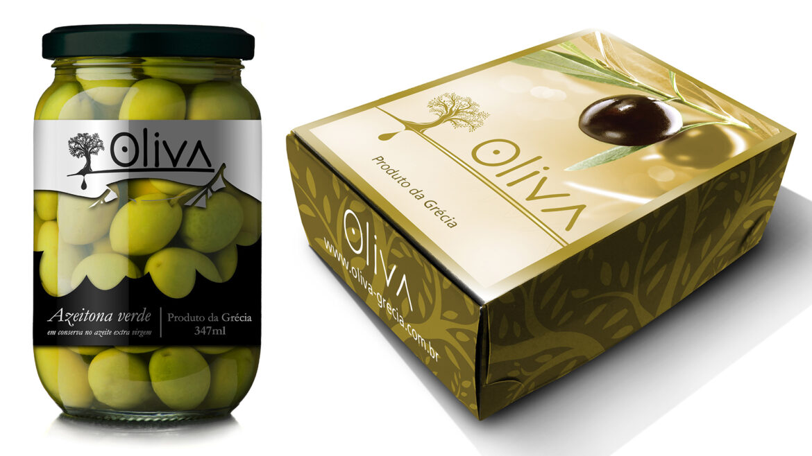
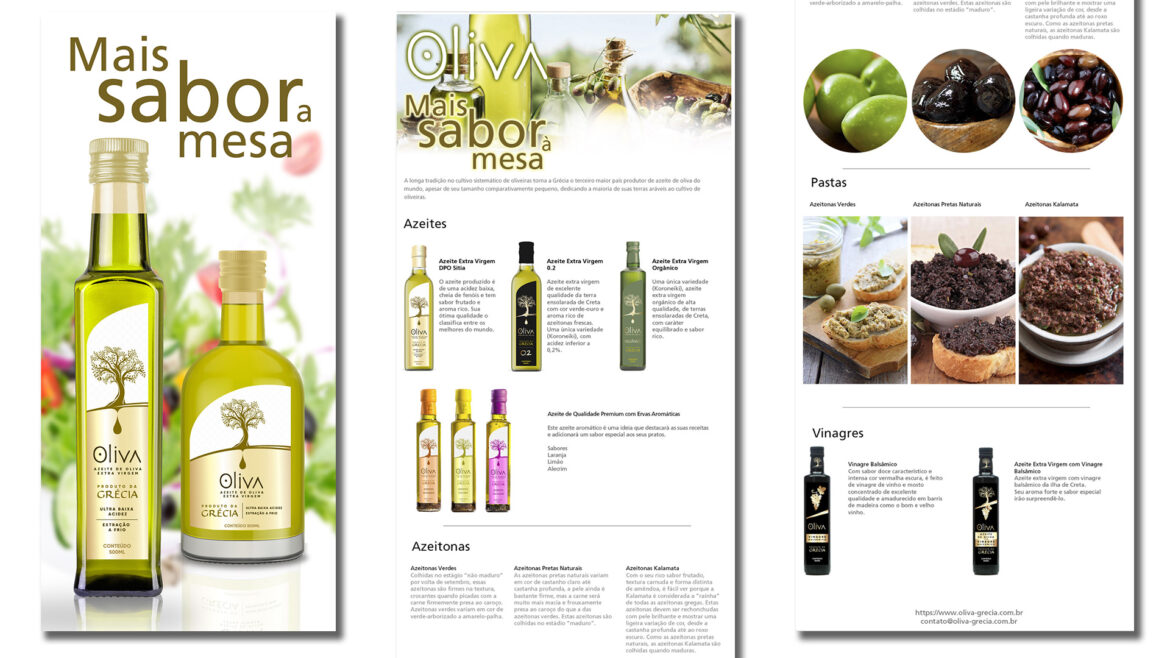
Oliva was a new food market player and as so needed almost everything to show up for the public and salers, but the logotype and the olives. The guidelines to develop the label and promotional package was that it should be seen as a premium product. The product label was used black and silver to give visually the feeling of a premium product, it also had a transparent area to show the product in the glass jar. The promotional box was done using the logotype color, a goldish ocher, with a highlight to a black olive. In the box would be fitted with 3 small bottles of olive oil, from acid to base taste. Two other works were done to help in the buyer's approach, a leaflet to be given for the supermarkets manager together with the promotional box and an e-mail marketing with all products that would be sold by the company.
- design
Recent Entries
-
Getting in the mapFinding your localization
-
Showing yourselfPresentation
-
Keeping your image aliveCampaigns


